


WWW
+
+
VOL.13: GASPAR NOÉ
NEXT PARAPHERNALIA VOL. ON MONDAY AT MINDNIGHT
+
+
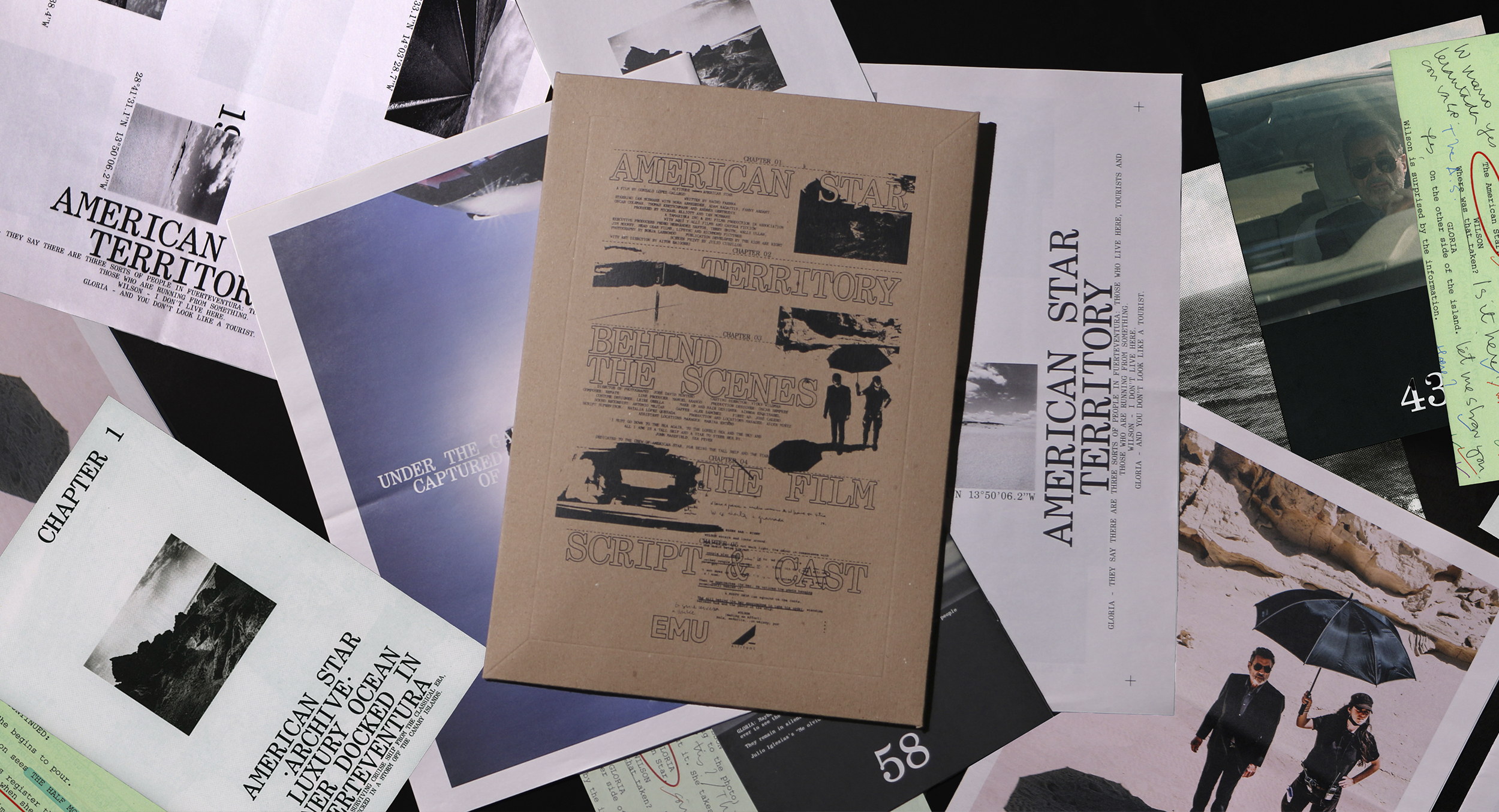
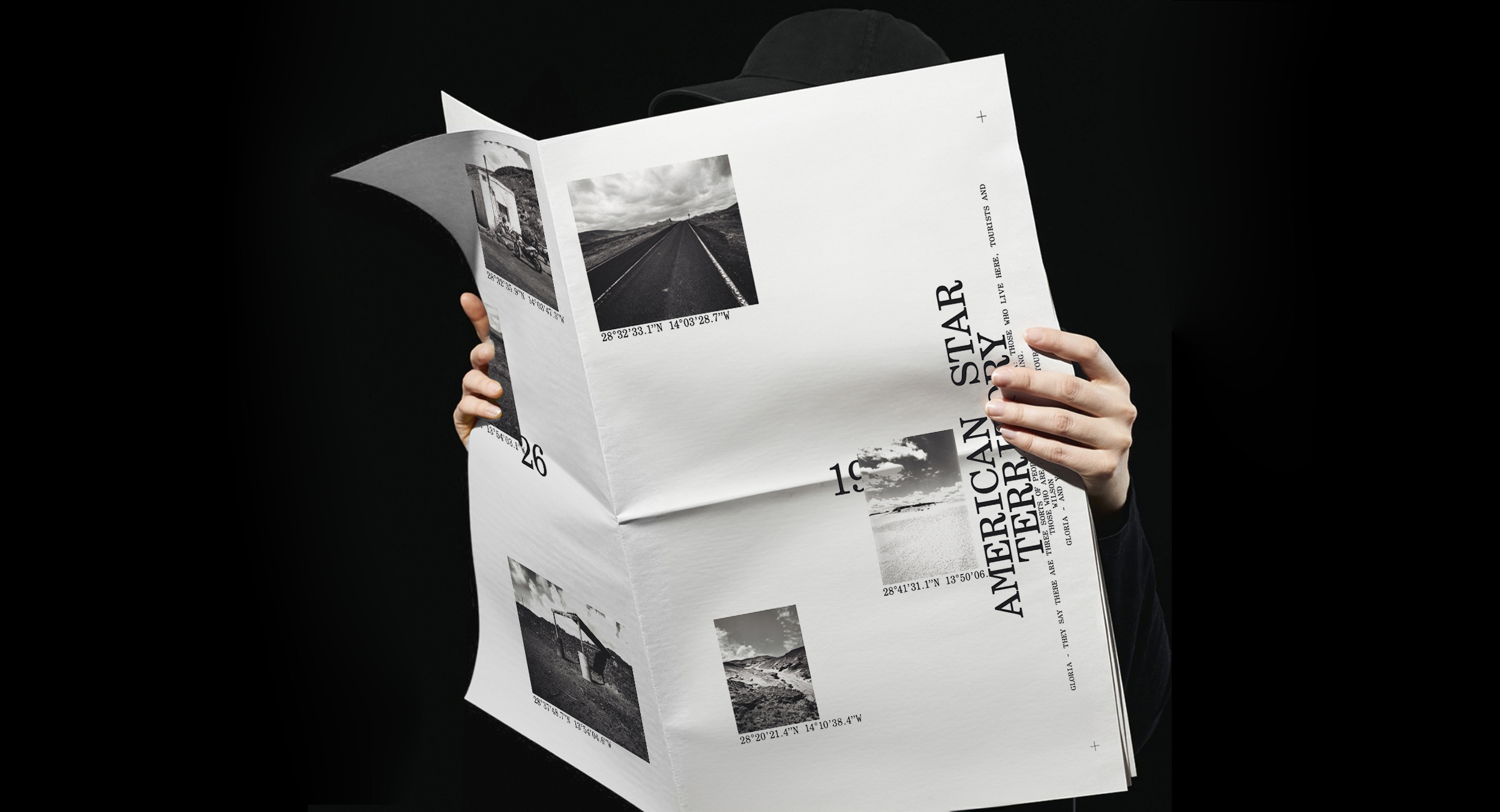
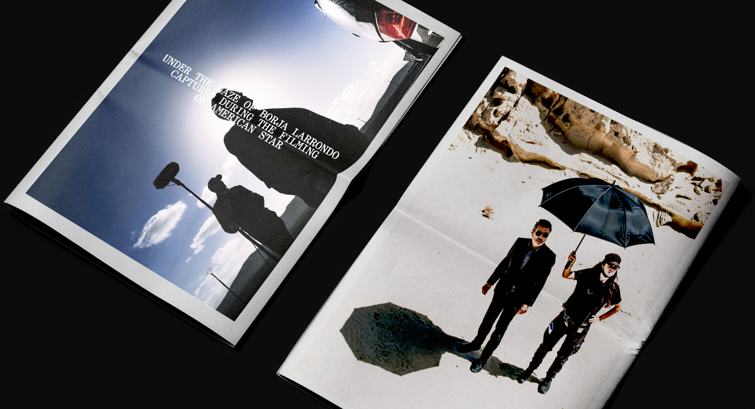
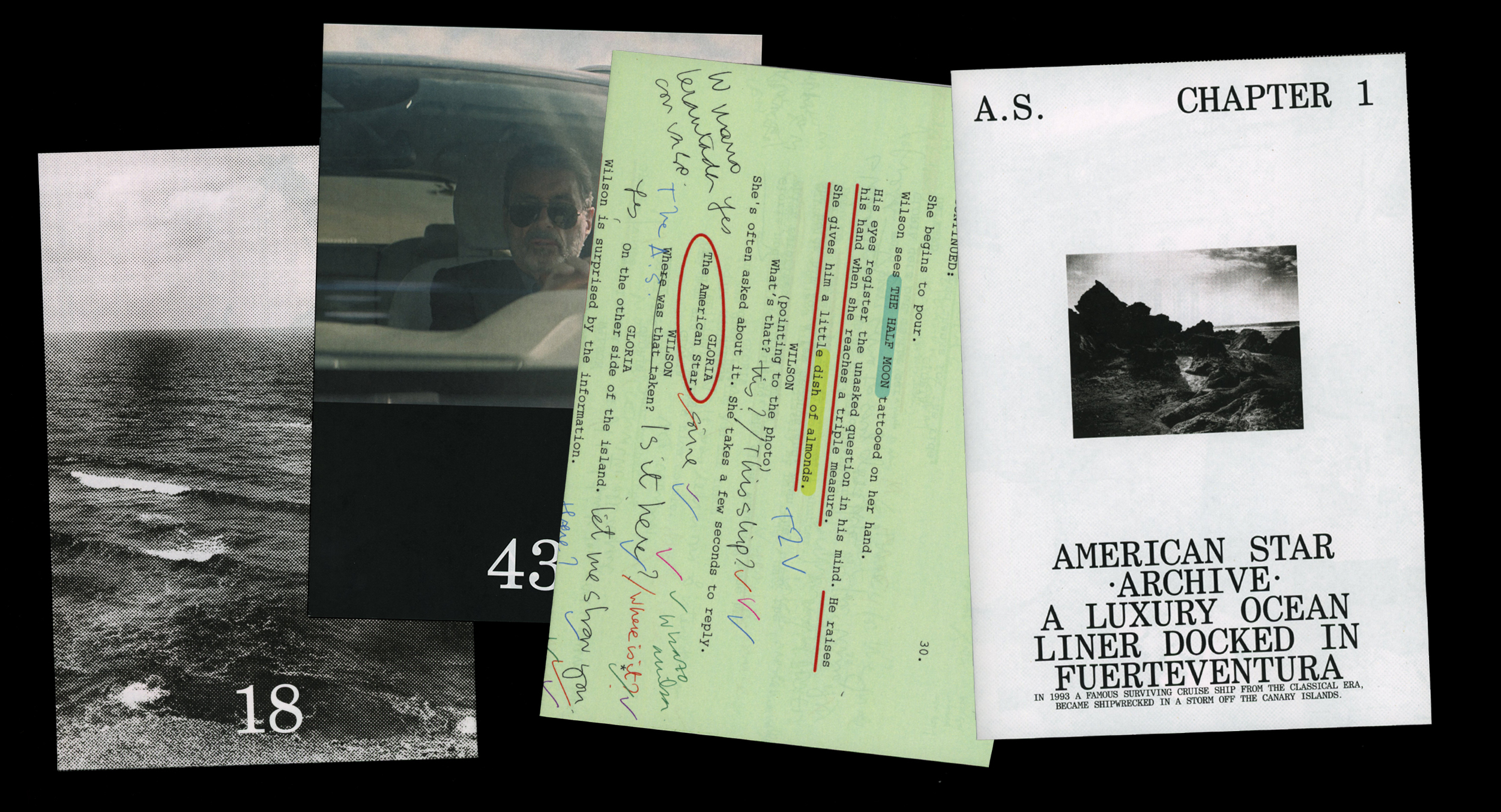
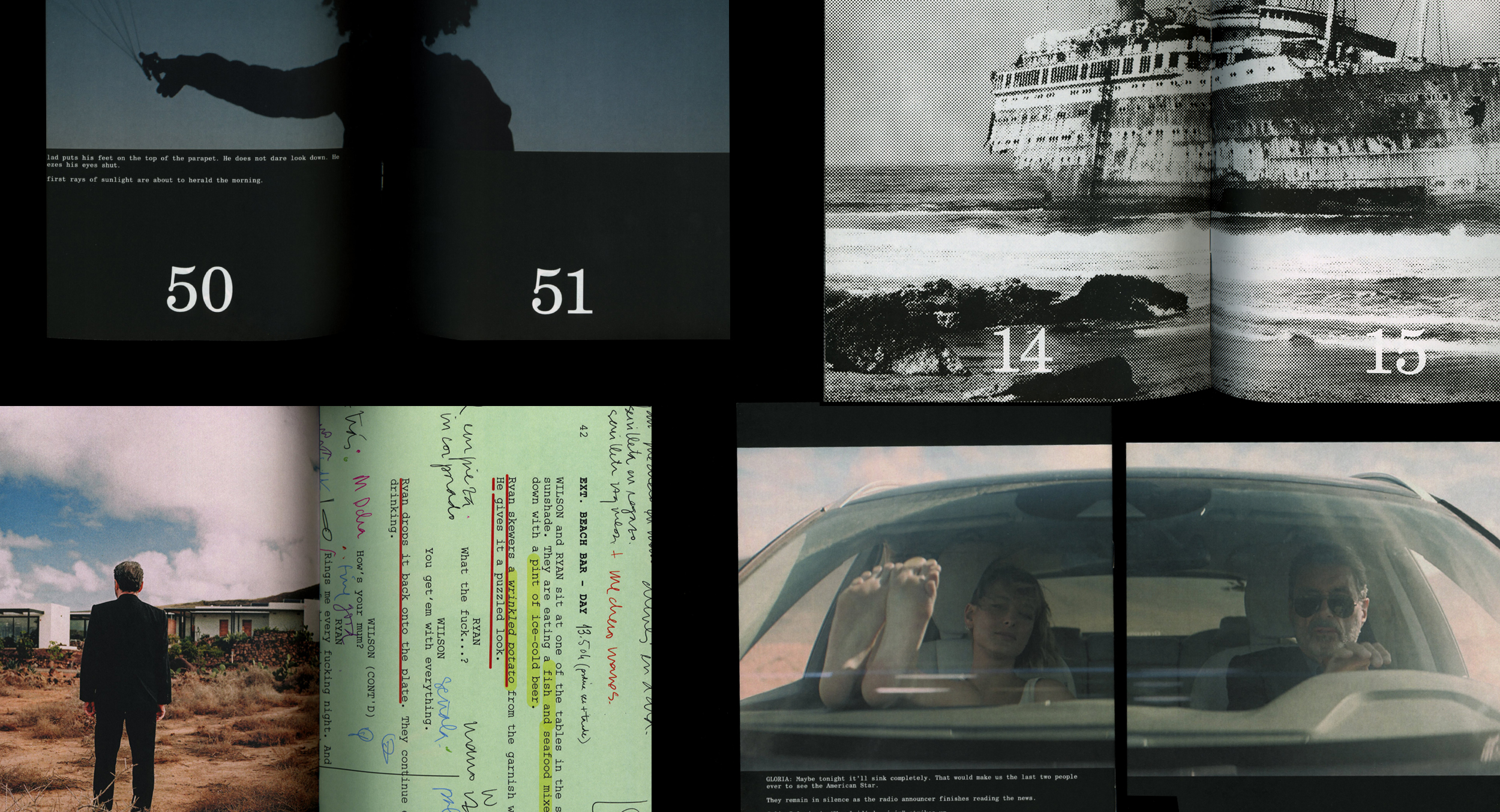
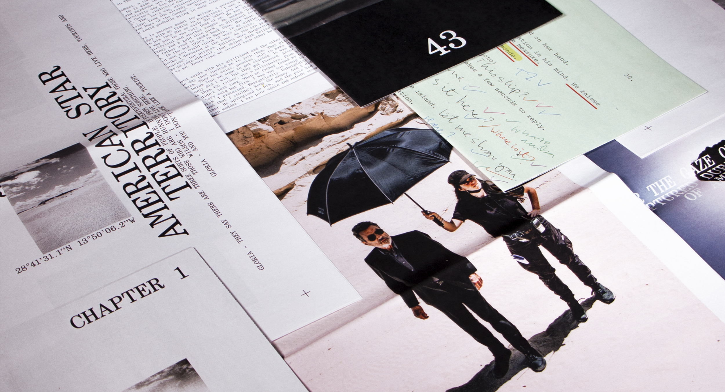
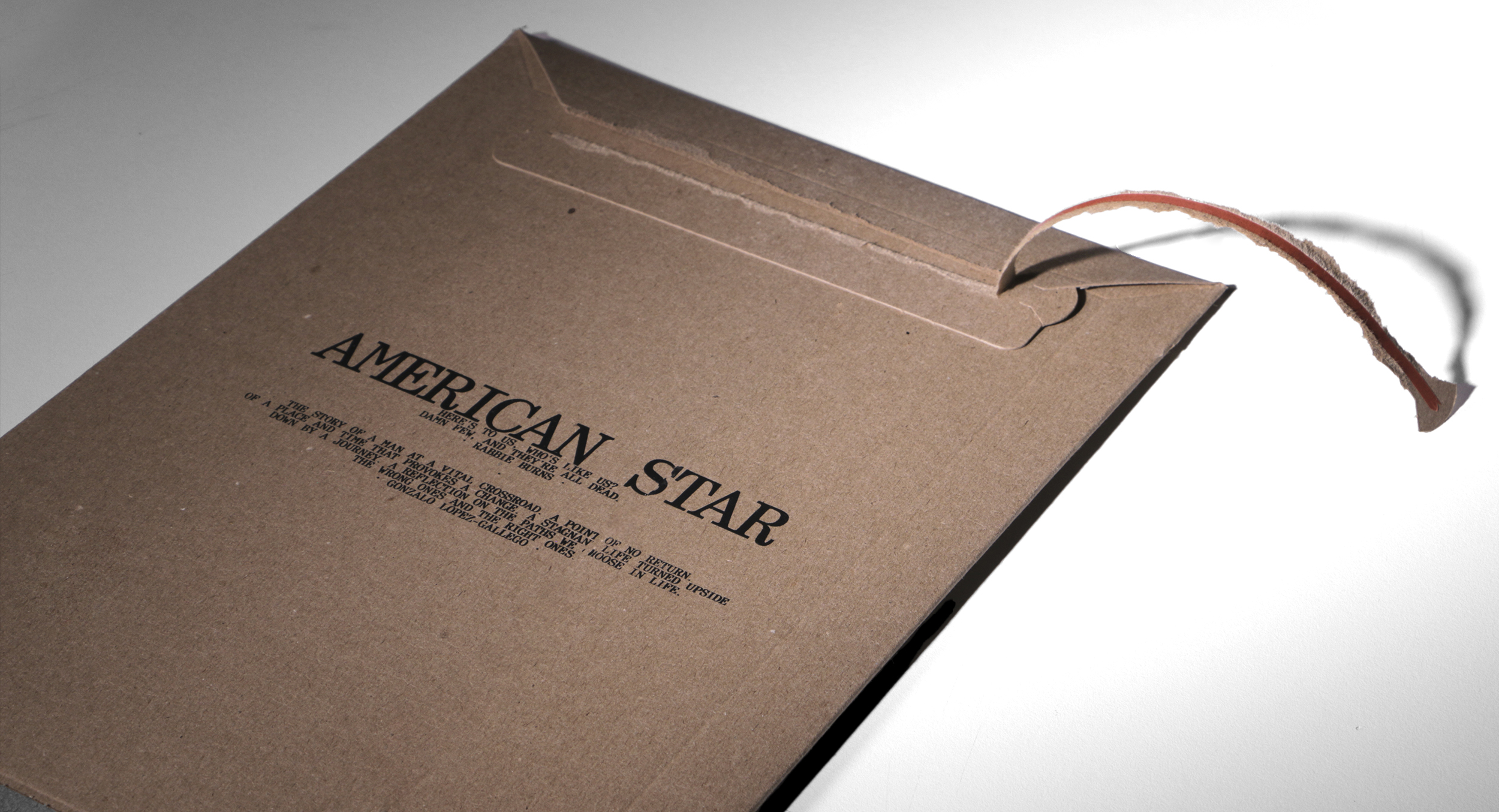
THE MOVIE AMERICAN STAR DEALS WITH THE STORY OF A MURDERER WHO FINDS HIMSELF IN FUERTEVENTURA, WITH THE MISSION OF KILLING A MAN HE HAS NEVER MET. WHEN HIS GOAL IS DELAYED, HE FINDS HIMSELF DRAWN TO THE ISLAND, THE PEOPLE, AND A GHOSTLY SHIPWRECK. THE PRESS KIT IS INSPIRED BY THE MISSION ENVELOPE.
029
AMERICAN STAR


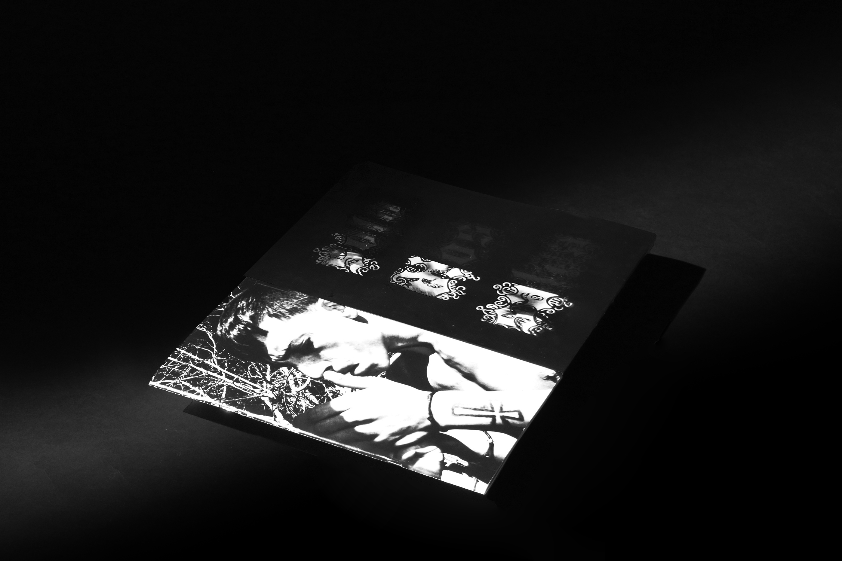
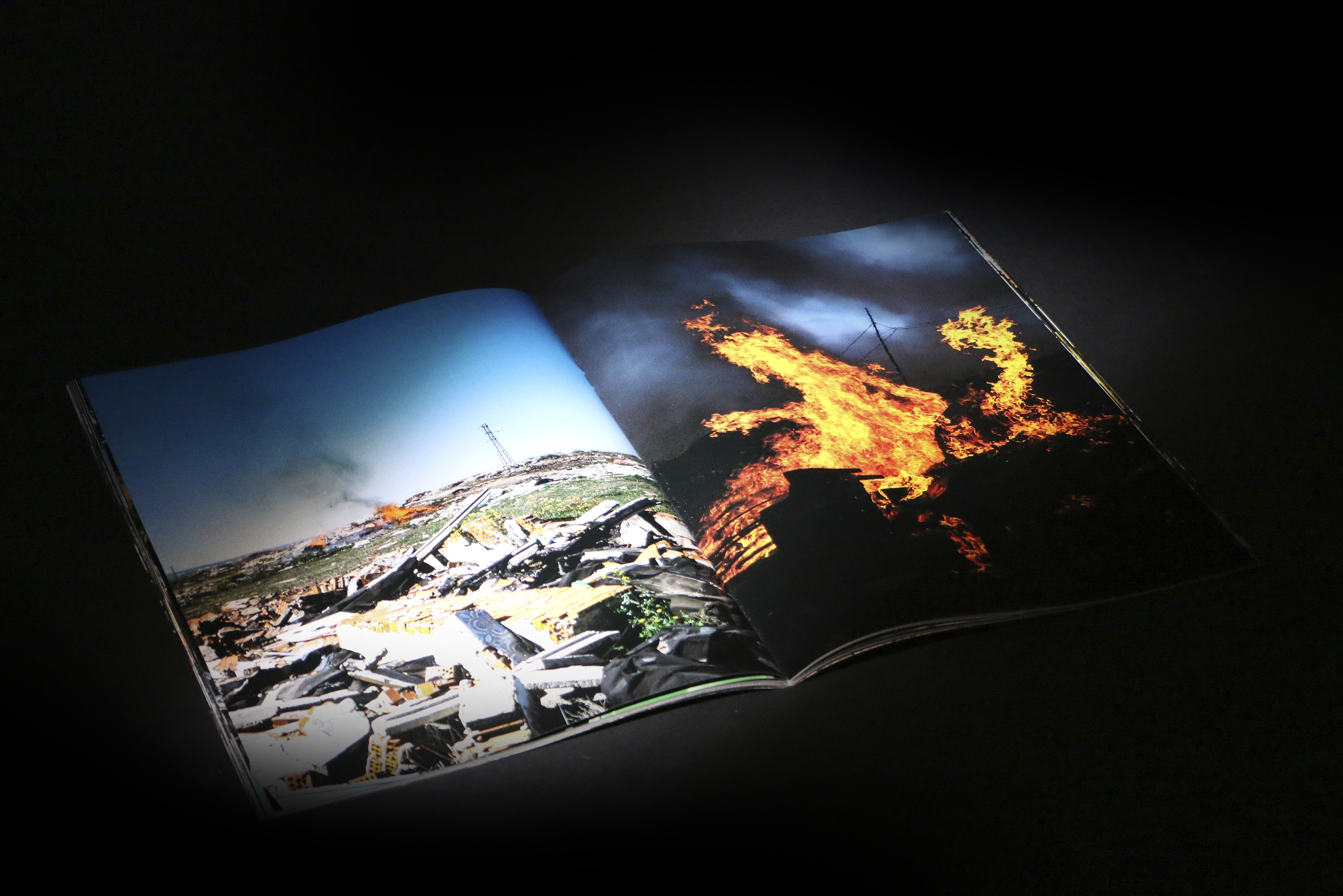
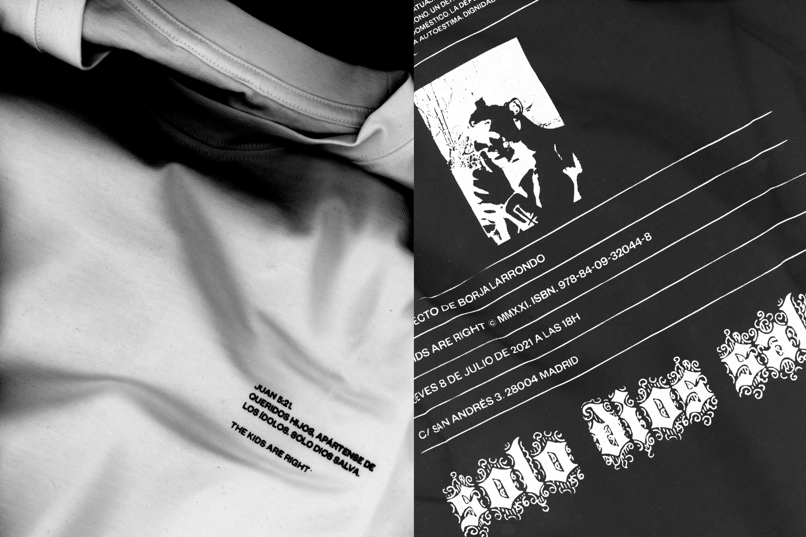
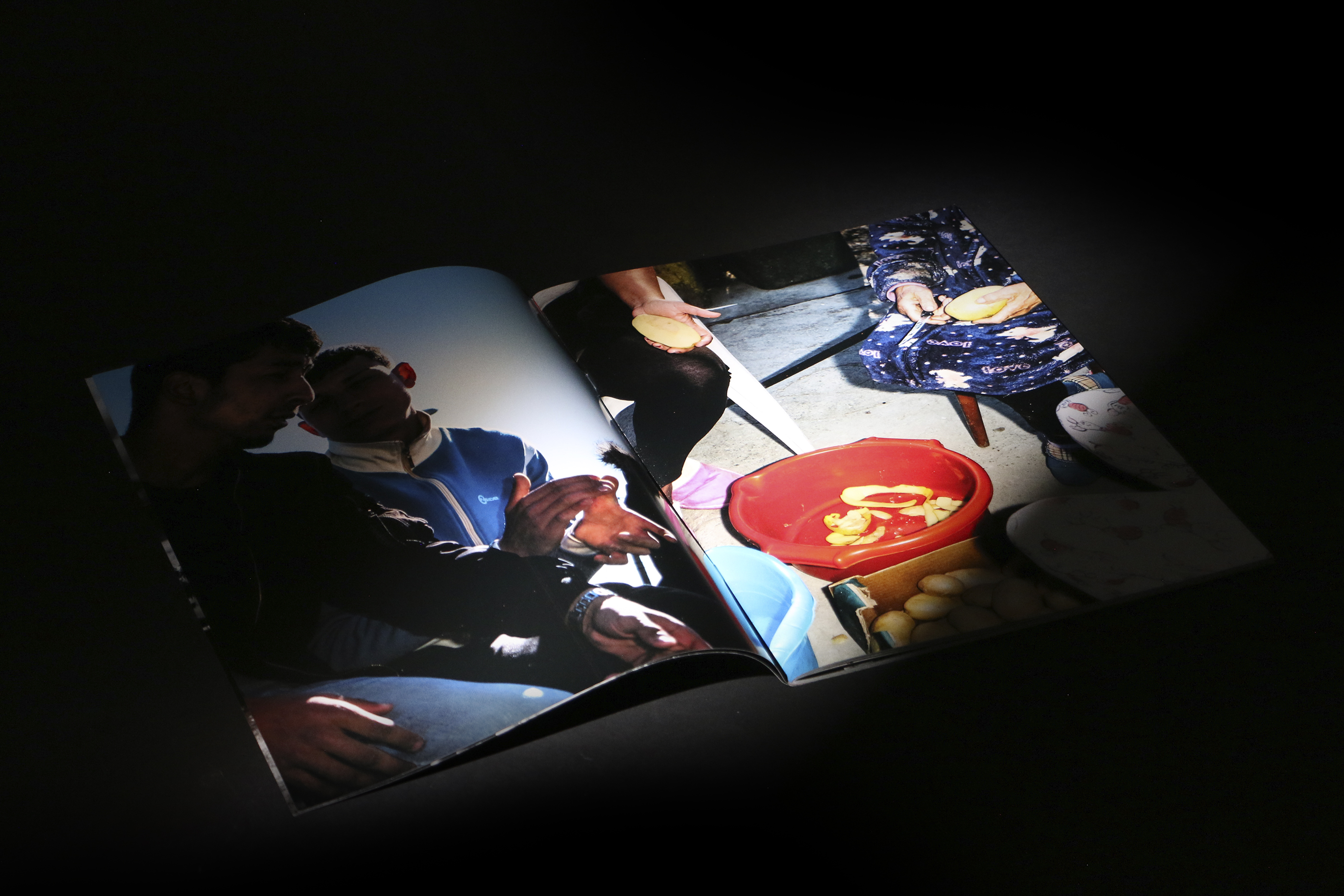
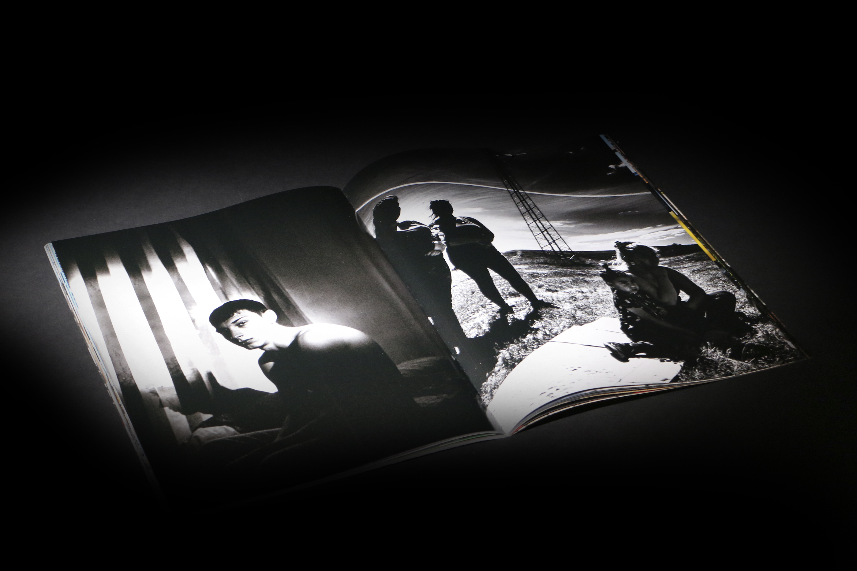
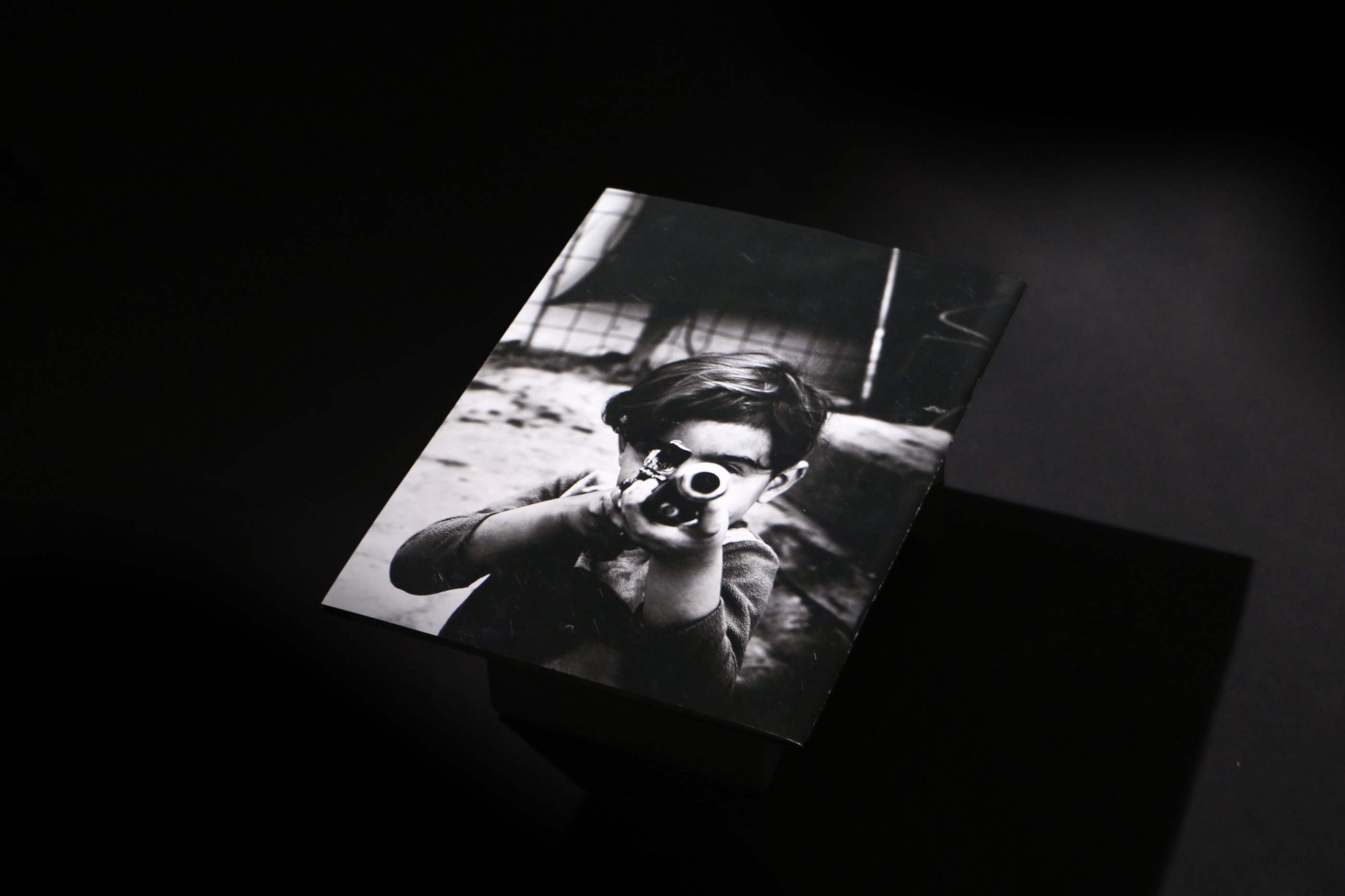
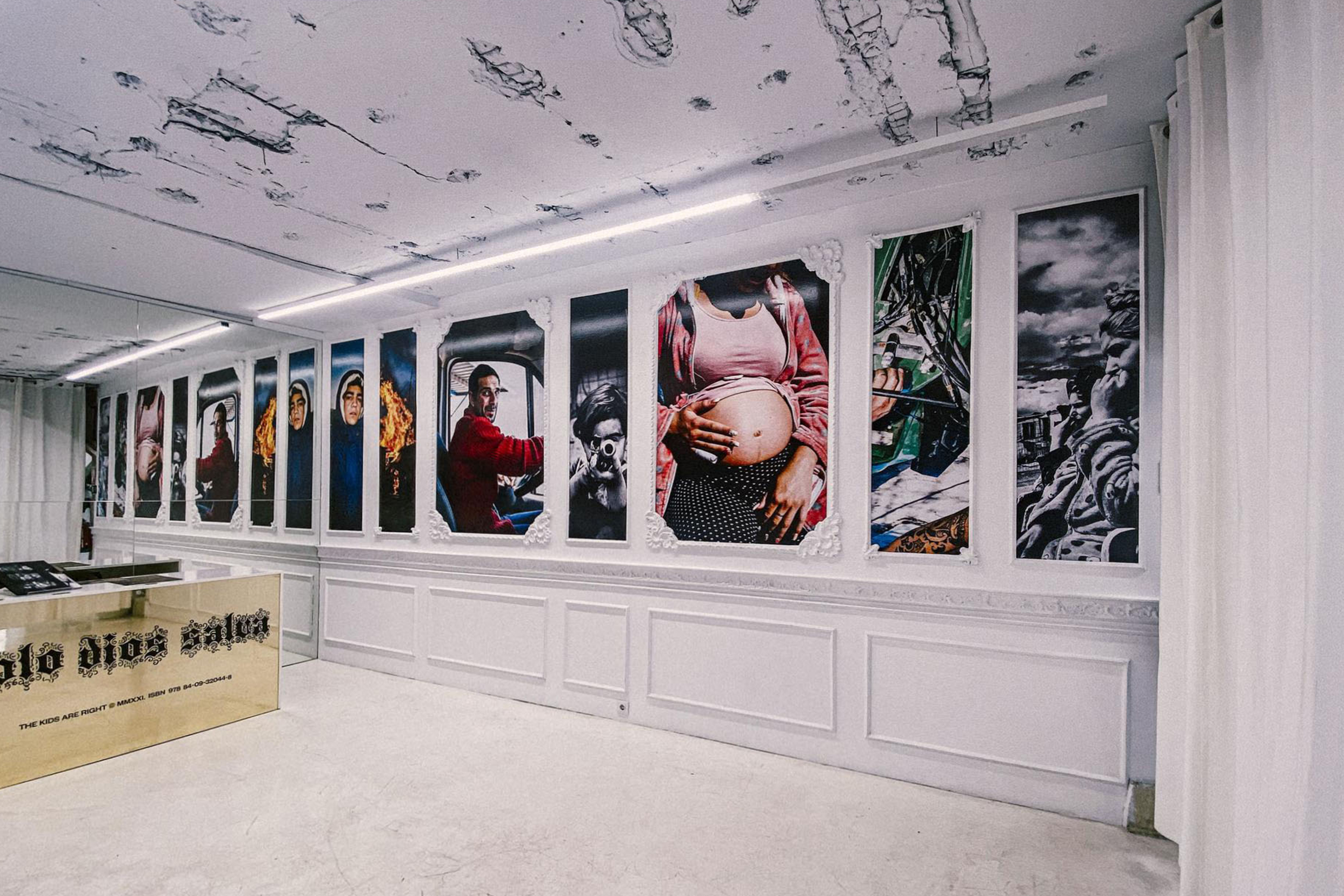
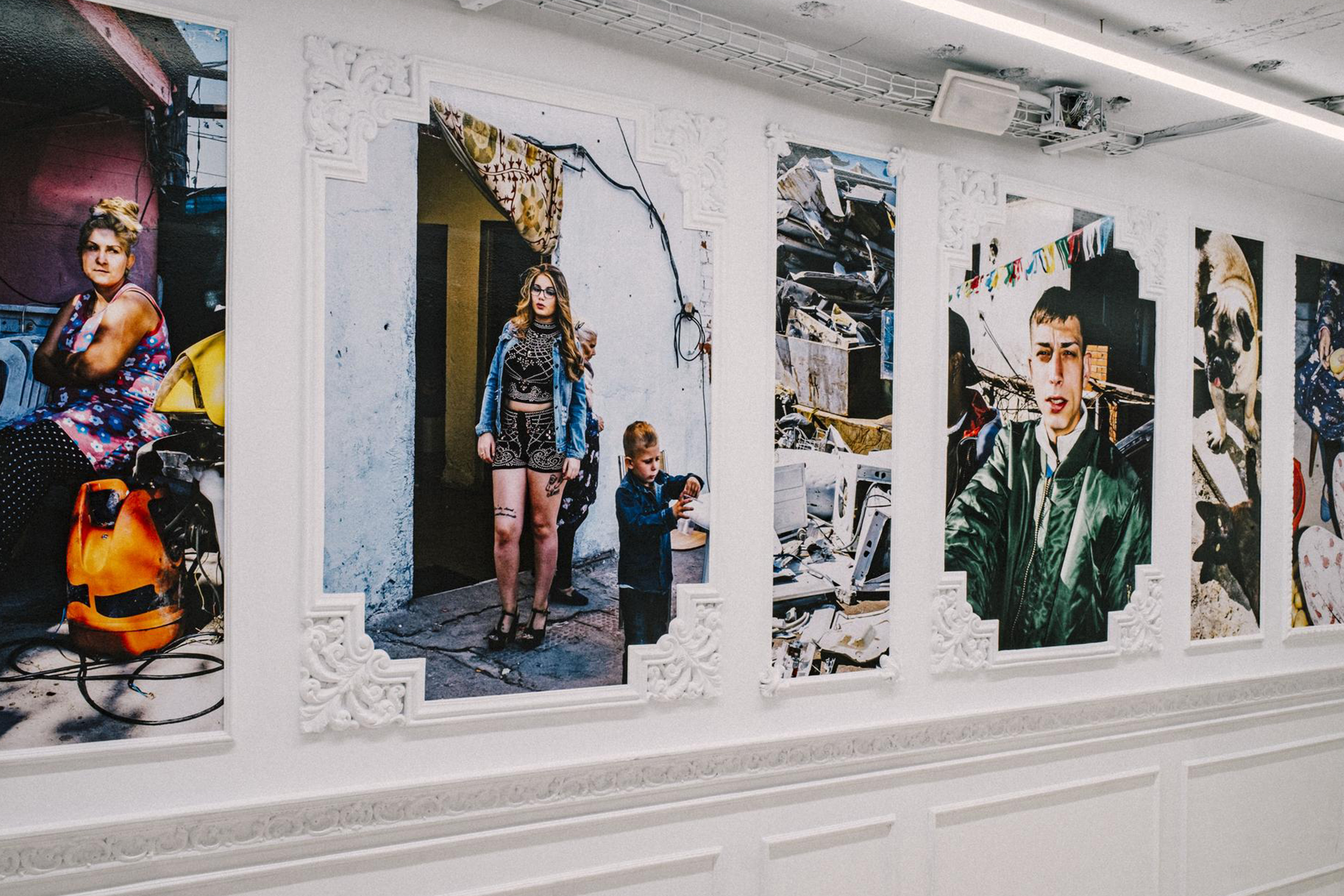
SOLO DIOS SALVA TELLS THE STORY OF THE LAST DAYS OF THE GABARRE-MENDOZA FAMILY IN THE CAÑADA RAL. DAILY LIFE SITUATIONS OF THOSE WHO LIVE IN LA CAÑADA. THE DOCUMENTALIST, AS IF HE WERE A LOCAL PHOTOGRAPHER, WITNESSES THEIR FEARS, PRESSURE AND ANGER AT THE DEMOLITION OF WHAT HAS BEEN THEIR FAMILY HOME. HIS HUMANISTIC LOOK LEAVES US WITH A WORK FULL OF IMAGES THAT PROVIDE A FEELING OF VITAL ENERGY AND COLOR. SOLO DIOS SALVA TELLS THE STORY OF THE LAST DAYS OF THE GABARRE-MENDOZA FAMILY IN THE CAÑADA RAL. DAILY LIFE SITUATIONS OF THOSE WHO LIVE IN LA CAÑADA. THE DOCUMENTALIST, AS IF HE WERE A LOCAL PHOTOGRAPHER, WITNESSES THEIR FEARS, PRESSURE AND ANGER AT THE DEMOLITION OF WHAT HAS BEEN THEIR FAMILY HOME. HIS HUMANISTIC LOOK LEAVES US WITH A WORK FULL OF IMAGES THAT PROVIDE A FEELING OF VITAL ENERGY AND COLOR.
028
SOLO DIOS SALVA


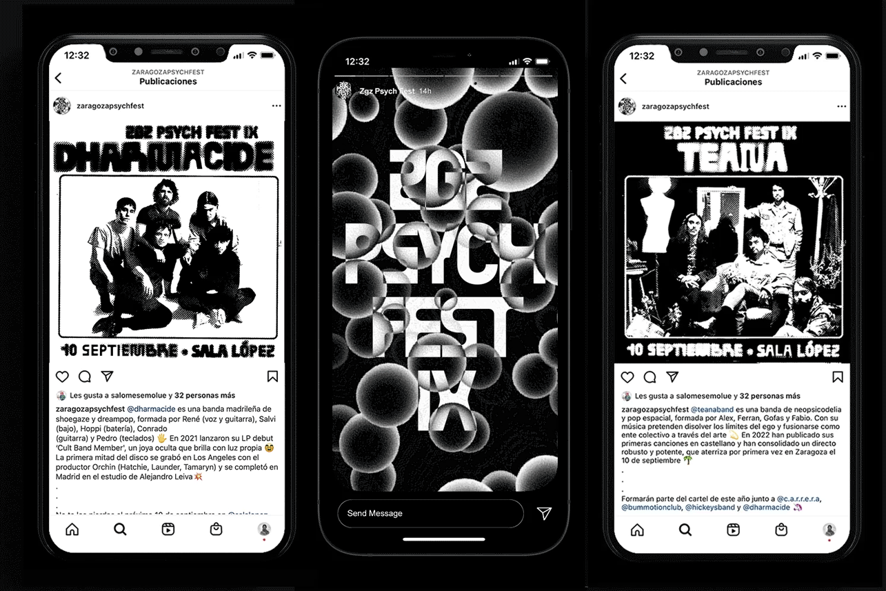
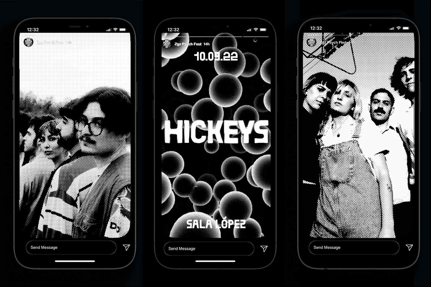
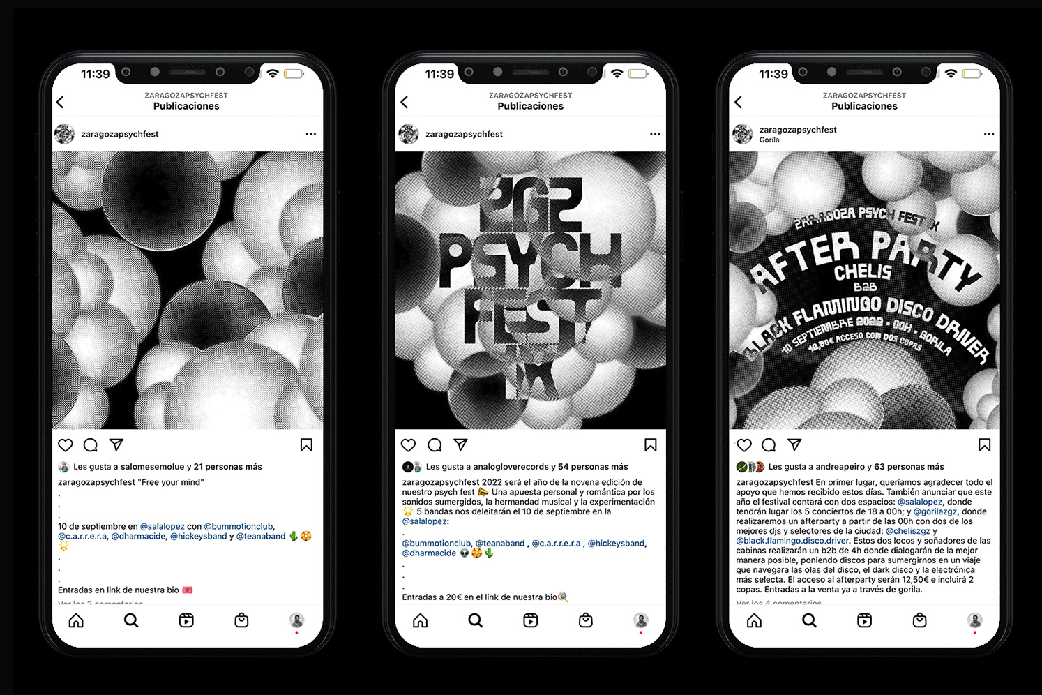
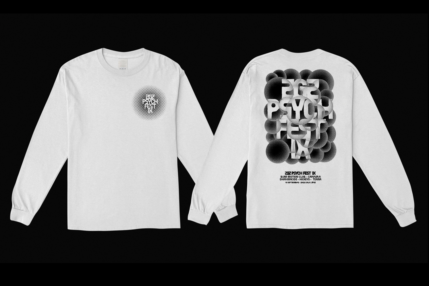
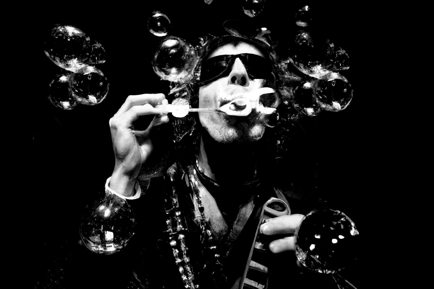
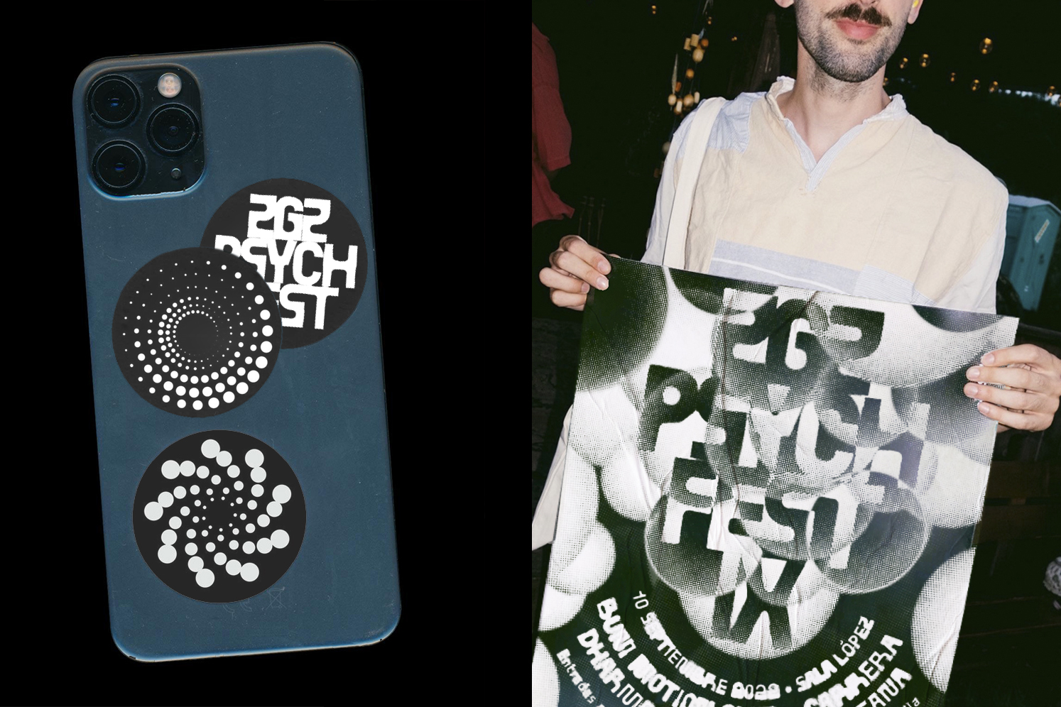
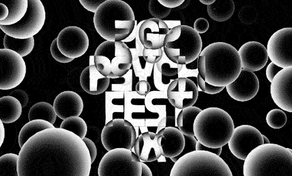
THE GRAPHIC IDENTITY FOR ZGZ PSYCH FEST IX IS INSPIRED BY THE SHAPES AND TEXTURES OF BUBBLES, WHICH HAVE AN ETHEREAL AND EPHEMERAL QUALITY THAT EVOKES THE CONSTANTLY EVOLVING AND CHANGING NATURE OF PSYCHEDELIA. A PSYCHEDELIC AND ETHEREAL JOURNEY. AN ADAPTABLE AND SCALABLE IDENTITY FOR USE IN DIFFERENT MEDIA AND PLATFORMS.
027
ZGZ PSYCH FEST IX


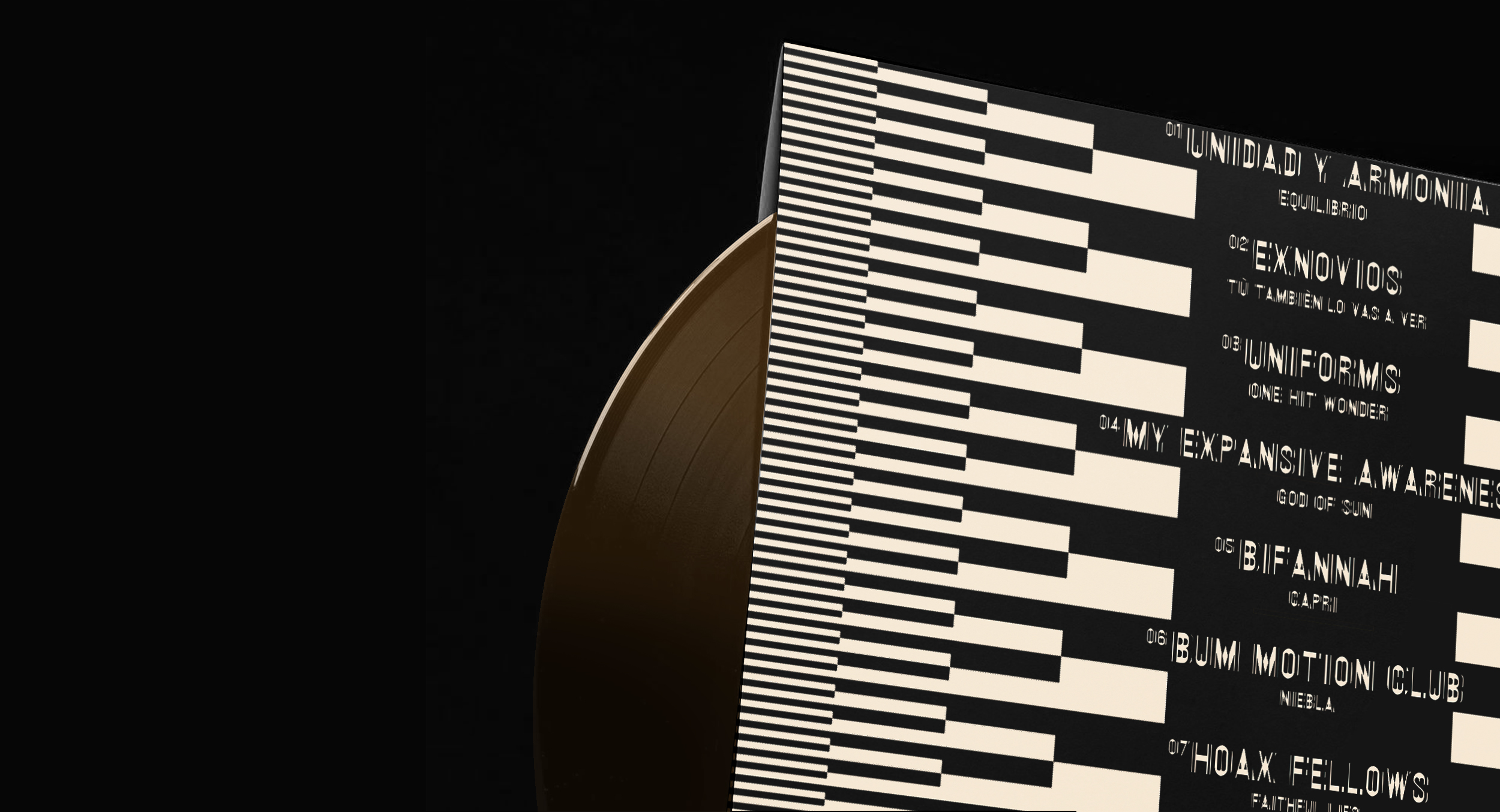
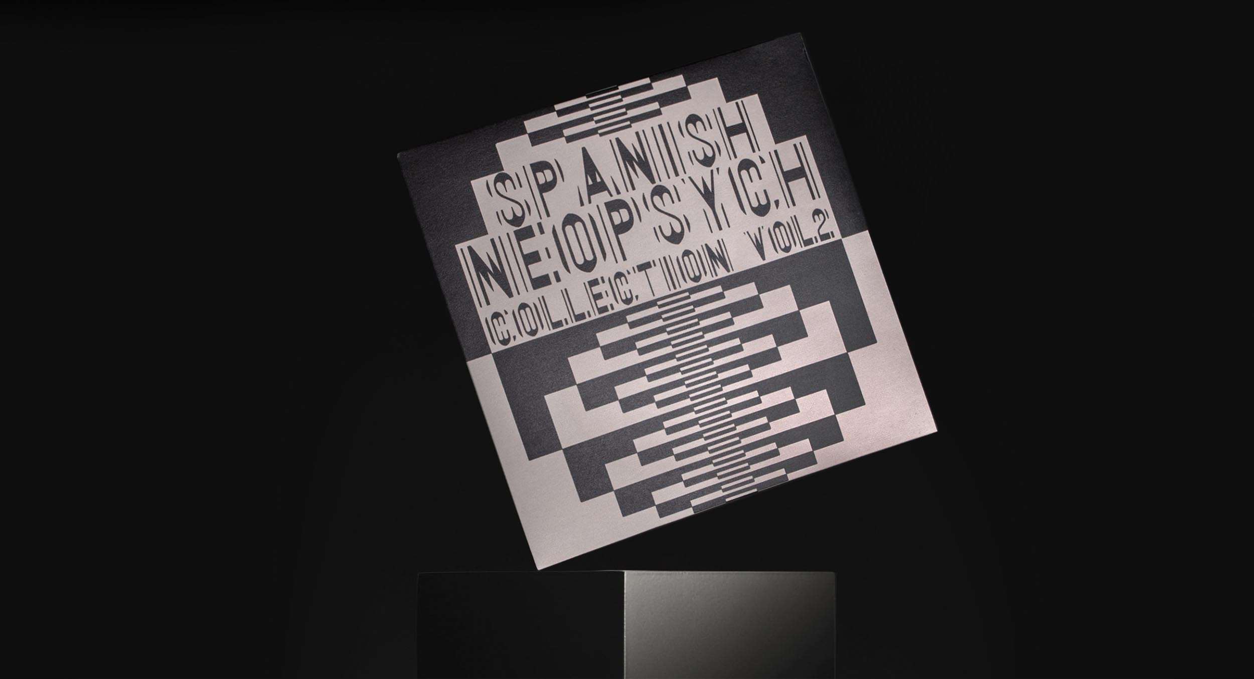
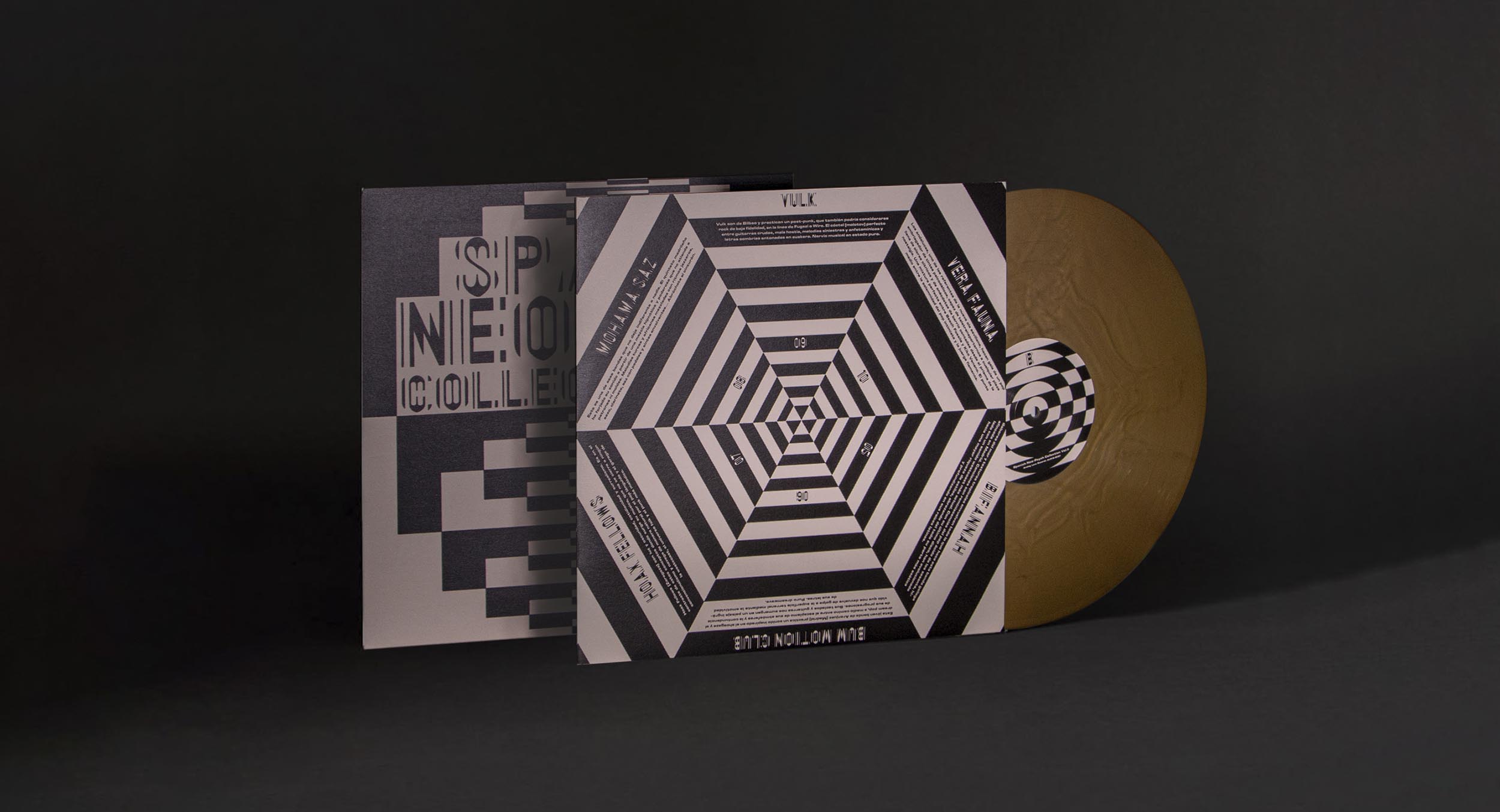
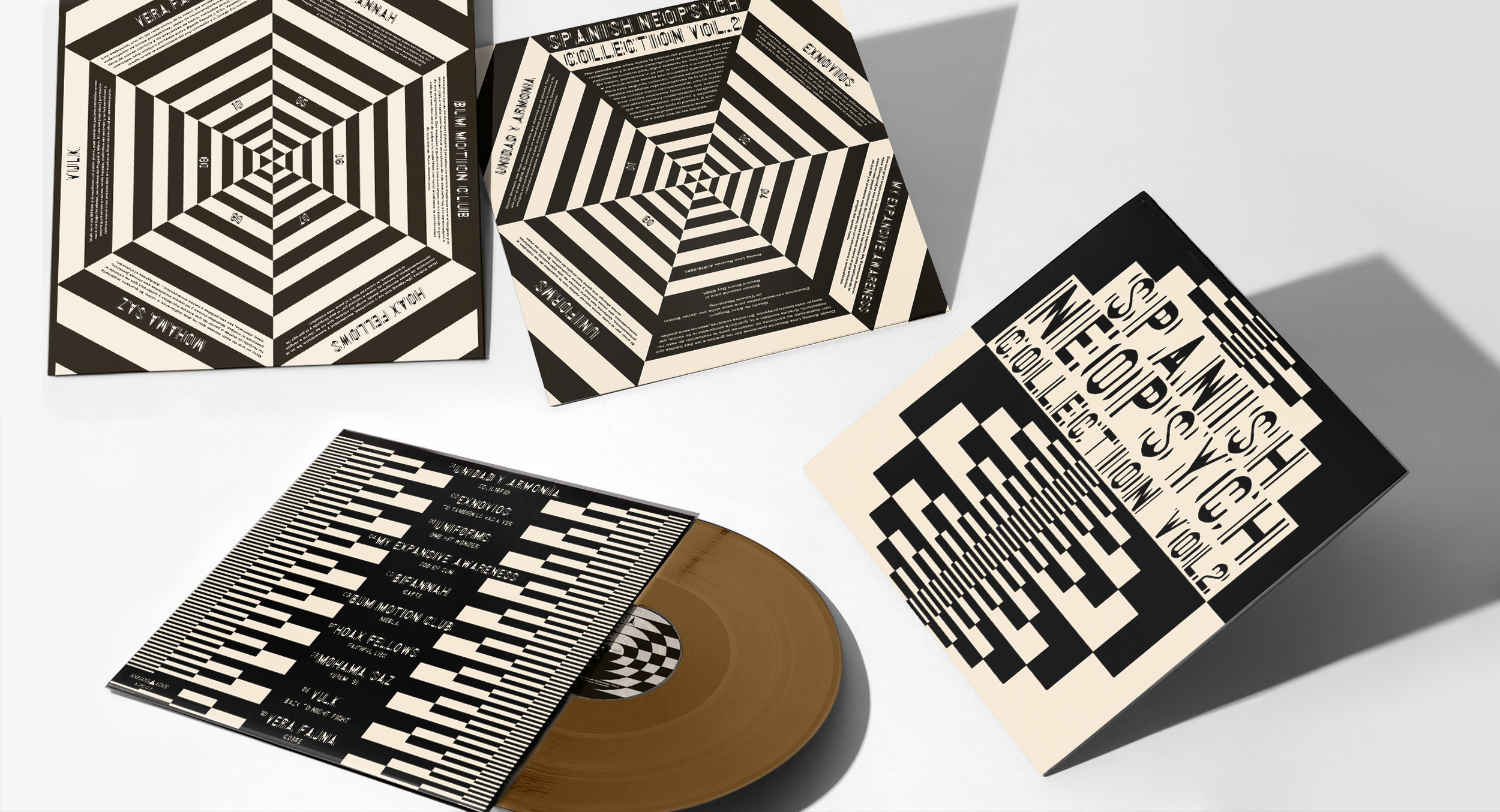
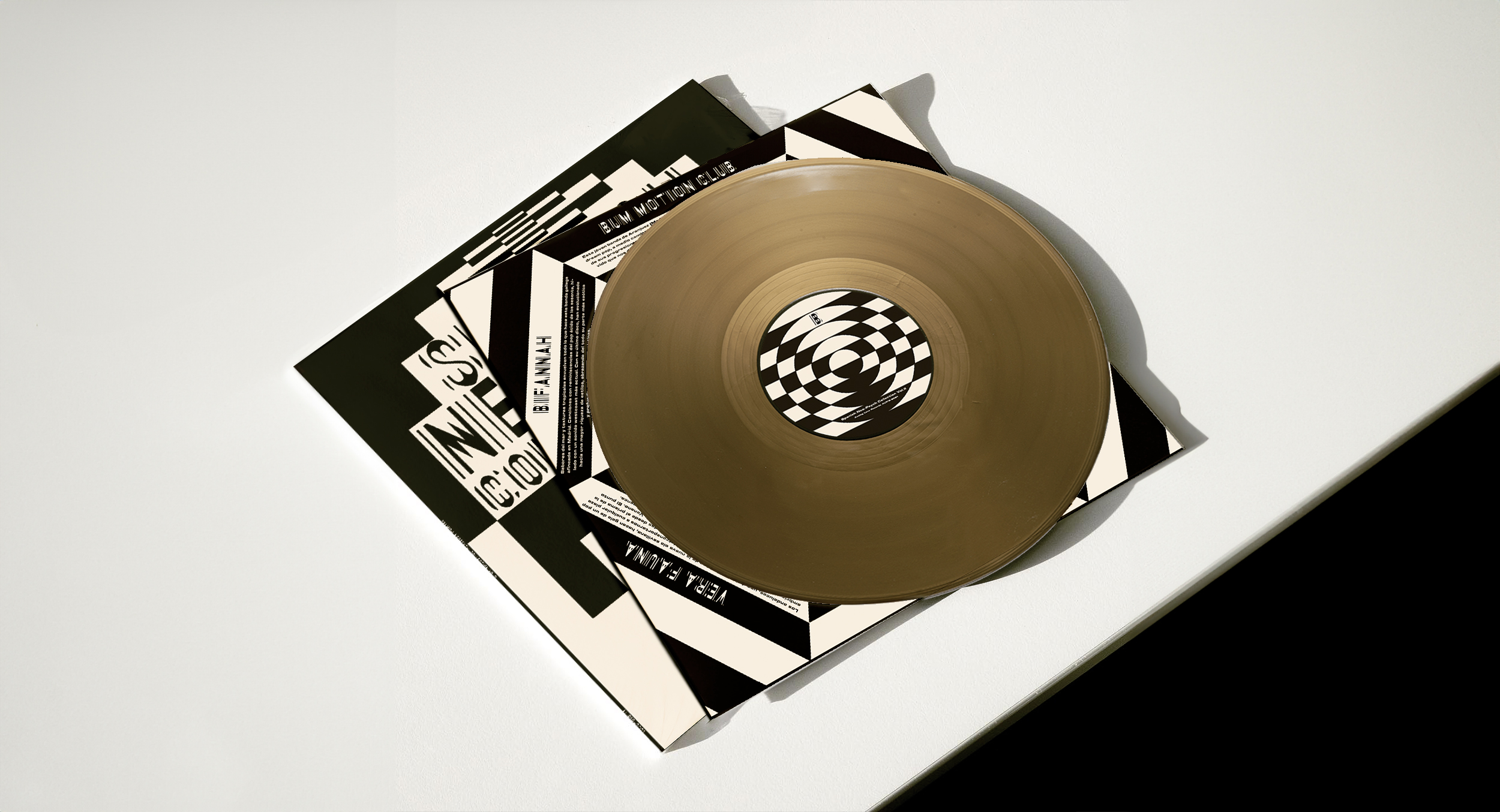
BLACK AND WHITE GEOMETRIC OP ART SHAPES ARE THE GRAPHIC IDENTITY FOR THE SECOND VOLUME OF THE SPANISH NEO-PSYCH COLLECTION. A VISUALLY STRIKING AND DYNAMIC EFFECT. TRYING TO GENERATE A PERCEPTUAL EXPERIENCE RELATED TO HOW VISION WORKS. AN ATTRACTIVE VISUAL EXPERIENCE AT THE SAME LEVEL AS SOUND.
026
SPANISH NEO - PSYCH COLLECTION VO
ARLAND IS A FASHION FIRM THAT BREAKS THROUGH THE MAINSTREAM BOUNDARIES. DYNAMIC, VISIONARY AND IT HAS A MISSION: TO CAPTURE THE ESSENCE OF NATURE, TEXTURES, SHAPES AND SOUNDS. IT GRASPS THE TRUTHFULNESS OF THE WORLD. THE COLOUR OF THE SOIL. THE STRENGTH OF THE SEA. THE WHISPER OF THE TREES. IT HAS MEASURED THE VITAL SIGNS OF THE PLANET. AIR, WATER, FIRE. THE CIRCLE REPRESENTS AND INFINITE FIGURE INSPIRED BY THE DISCOVERY OF THIS NEW LAND THAT DEFINES ARLAND.
025